
Web accessible colors for products and websites is crucial to establish an instant connection to visitors! Having accessible colors on your website makes it easy to browse and find information, read product reviews, look at product designs and samples.
In today’s digital age, creating inclusive products and websites has become more important than ever. One crucial aspect of inclusivity is ensuring that your color choices are web accessible, meaning they are easy to distinguish for users with visual impairments.
To establish an instant connection with the website and its users, color is a potent weapon. A pleasant design may help create a positive overall impression. It may help draw attention to the crucial components on the page.
Most importantly, it may establish the atmosphere, distinguishing between cheerful and sociable and sober and stylish.
But when developers neglect to take into consideration the many ways in which consumers perceive color, what was once a useful tool may quickly become a challenge.
This is why it’s crucial to consider color accessibility when designing a website. Making certain colors function to their full potential—improving rather than detracting from the online surfing experience—is the essence of accessibility in website color.
But with so many color options available, it can be overwhelming to identify which ones meet web accessibility standards. That’s why we’ve put together these quick guidelines to help you easily identify web accessible colors for your products and websites, so you can ensure your designs are accessible to everyone.
Why Accessibility in Design is Important?
Accessibility in website and product design is to craft experiences for all, including those with visual, auditory, and cognitive disabilities. As a designer or a developer, you have the power to create a web to be proud of. An inclusive web made for and consumed by all people.
Web accessible colors are important because it enables people with visual impairments or color vision deficiencies to interact with digital experiences.
Apart from web accessibility
A Succinct Explanation of Website Accessibility
The process of creating a website that functions for users of different abilities is known as website accessibility.
A designer will decide which conditions to concentrate on and develop solutions among the several types of disabilities, such as visual, auditory, and mobility impairments.
Providing alternate text for photos, making keyboard navigation simple are some examples of web accessibility features.
Although the emphasis of this post will be on colour accessibility, it is important to consider accessibility in its entirety.
In many nations, inaccessible websites is a discrimination. For instance, in the U.S. the Americans with Disabilities Act protects web accessibility. According to the ADA, users have the legal right to sue businesses that fail to make their websites accessible.
The Web Content Accessibility Guidelines (WCAG) published by the W3C provide developers and designers with precise benchmarks to work toward in terms of website accessibility.
This post will use the WCAG as a reference since it provides well-accepted standards.
Color-related WCAG guidelines mostly pertain to visual impairments. This emphasizes contrast, making it easy to see the text apart from the backdrop. The rules also pay close attention to the use of colour as a visual indicator.
Common Disabilities That Are Affected by Color
According to the WHO, at least 1 billion people live with some form of disability. There is a range of disability, many impairments may be situational or transient.
For instance, the glare from the sun will damage the vision of someone using a computer outside in bright sunshine.
Web accessible colors for websites and products online will help people with visual impairments make the right choices online. Making websites accessible is not just morally right, it makes sense. Let’s discuss some typical color perceptions keeping different disabilities in mind.
The term “color blindness” might be misleading since it does not always imply that the affected individual is color-blind.
The two impairments we’ll examine here are dyslexia and attention deficit hyperactivity disorder (ADHD). In these situations, a rainbow of colors might function as a diversion. However, when used correctly, color can be a powerful tool for directing attention.
Why Is Color Contrast Important to Persons with Disabilities?
Color contrast is important for helping website users with visual impairments differentiate between your content and the site’s backdrop.
Checking the color contrast on your website proactively can save you against demand letters, expensive litigation, and reputational harm. Using web accessible colors helps people with visual impairments distinguish between text and background elements.
An all-purpose tool, a color contrast checker may be used to examine slideshows, infographics, web pages, and more. Any web designer or company owner must have it.
You are improving the user experience for all visitors, including those who have visual impairments, by using proper color contrasts. In 2017, The World Health Organization, reported that roughly 217 million people live with some form of moderate to severe vision impairment. That statistic alone is enough to jolt you to design for accessibility.
Legal implications
Apart from accessibility being the ethical thing to do for your business, the potential legal implications are greater for non-compliance. In 2022, plaintiffs filed 3,255 lawsuits – a 12 percent increase from 2021. The Worldwide Web Consortium (W3C) and the United States Access Board have established accessibility standards for websites.
- Section 508: 508 compliance refers to Section 508 of the Rehabilitation Act of 1973. You can read the in-depth ordinance here, but to summarize, Section 508 requires that your site needs to be accessible if you are a federal agency or create sites on behalf of a federal agency (like contractors).
- W3C: The World Wide Web Consortium (W3C) is an international, voluntary community that was established in 1994 and develops open standards for the web. The W3C outlines their guidelines for web accessibility within WCAG 2.1, which is essentially the gold standard for web accessibility best practices.
Making Web Accessible Colors for Websites
Color is an effective tool for visual communication and is a fundamental component of design. Because of how handy it is, we often utilize it without consciously realizing how it functions.
Let’s study the typical functions the color provides on a website in order to reevaluate colors used for accessibility. In general, the purpose of color is to describe, focus, and provide feedback.
Branding
A particular color palette is crucial to a company’s visual identity. Consider Twitter’s blue or Netflix’s crimson. To put it another way, in this instance, color serves as a visual shorthand for a company name.
Visual hierarchy
It can be used to emphasize the main points on a page and establish hierarchy, giving readers visual cues to help them focus their gaze.
Use colors to indicate distinct topics on a web page or indicate a form field element.
Visual feedback
The most typical colors for this are red and green—a green checkmark when a user checks a box or a red “X” when a user clicks on something they are unable to see.
Data visualizations
Color may be used to distinguish between interactive text and active text. The fact that hyperlink text is often blue in color serves as the most prevalent example.
Guidelines for Creating Color Palettes for Accessible Websites
Without further ado, let’s discuss how you may use color schemes on a website design to apply accessibility principles.
The Fundamentals of Contrast
Colors are actually all about contrast, if you think about it. There wouldn’t be much to see if everything was the same shade. Making things stand out on the screen is color’s most fundamental function in web design; the challenge is to what extent and concerning what other aspects.
Designers visually convey contrasts between design items using contrast. It is quantifiable on a scale of high to low.
Text-to-background contrast ratios are recommended by WCAG. These may change depending on the text’s size, as well as how stringent of a standard you wish to follow.
According to the WCAG, the ratio is graded on a scale of AA (minimum accessibility compliance) to AAA (maximum accessibility compliance).
Level AA contrast – 4.5:1 for text smaller 18pt and 3:1 for text larger than 18pt; Level AAA contrast – 7:1 for text smaller than 18pt and 4.5:1 for text larger than 18pt.
Using one of the many available online contrast checkers is the simplest approach to determine if a color scheme adheres to this ratio. Popular ones include Stark and Adobe Color Contrast.
Make a Color Scheme for Your Website That Is Available in Advance
The colors of a website must complement one another since they do not exist in a vacuum. To ensure that the colors are harmonious and yet meet the WCAG guidelines for contrast. It is crucial to lay out an accessible color scheme in advance.
Web designers frequently have to take into account a variety of color scenarios in addition to the pre-established brand colors. These colors are part of a visual identity, such as an accent color (often used for buttons), feedback colors to indicate a user is online, etc.
Additionally, they must choose particular neutral colors that will often be utilized for backgrounds, body content, and headers typically on the white, grey, and black color scale.
Creating Web Accessible Colors for Products
If you account for accessibility early on in a product’s lifecycle, you can reduce the time and money to make your products accessible later. Color accessibility requires a little effort up-front, when selecting the color palette for your product. However, ensuring web accessible colors for your product pays off massively in the end!
Here are a few quick and effective tips to build color-accessible products.
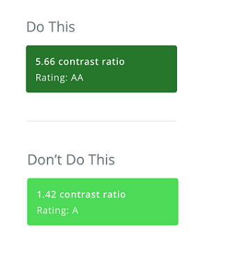
Add Enough Color Contrast
Make your background to text contrast ration at least 4:5:1 to meet W3C’s minimum AA ratings. When designing elements like buttons, be sure to check the contrast ratio of your color combinations.
The most helpful tools to test the accessibility of color combinations are Colorable and Colorsafe. Colorable allows you to adjust the hue, saturation, and brightness in real-time. You can see how it affects the accessibility rating of a particular color combination.
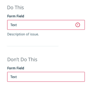
Don’t Rely on Color Alone
You can ensure accessibility by not relying solely on color alone to convey crucial information. So, for error states or system warnings, use messaging to convey clearly what is going on.
Focus State Contrast
Focus states help people to navigate your site using a keyboard by providing a visual indicator around site elements. This helps people with visual impairments, people with motor disabilities to navigate with a keyboard.
Conclusion
In conclusion, choosing web accessible colors is a crucial step in creating inclusive products and websites. By following these quick guidelines, you can ensure that your designs meet web accessibility standards and are accessible to all users, including those with visual impairments.
Remember to test your color choices with web accessibility tools and to make adjustments as needed. With these practices in mind, you can create designs that are both visually appealing and inclusive, making for a better user experience for everyone.