
Document accessibility makes digital documents accessible and available to all, especially people with disabilities. Digital downloads are a common way for foundations and organizations to share knowledge and resources. Regardless of whether you are creating a Word document, PDF, slide deck, or spreadsheet, there are steps you can take to make your download more accessible to people with disabilities.
Understanding Document Accessibility
Millions of people with disabilities navigate the internet through the use of assistive technology. For example, people who are blind or have low vision may use screen readers to read a website’s text aloud. In order for these devices and software to effectively access content and functionality on a website, the site design must meet web accessibility standards. While web accessibility is for HTML pages on a site, content creators often overlook accessibility standards for their downloadable content, causing potential challenges for people with disabilities.
Document Accessibility Checklist
We’ve put together a checklist of things you can do to make your downloadable documents more accessible. We recognize that this checklist is not a comprehensive guide on how to make all downloads completely accessible for all users. Instead, it is a general-use guide and highlights the important factors to consider when designing and creating a downloadable document. These recommendations follow WCAG 2.1 standards for AA accessibility.
Design for Document Accessibility
Use a Simple Layout
Focus on creating a layout that helps users understand the content order, and content relation to each other. Use built-in functionality like columns, line spacing, and alignment options to organize the layout, not “shortcuts” like including extra spaces to change alignment. Simple layouts will enable assistive technology to more easily navigate the document, and it will help people with cognitive and sensory processing disabilities too.
Use Headings Correctly
Almost all authoring software will include a built-in function that lets you apply headings and subheadings to your document. Headings and subheadings should form an outline for your document (Heading 1 for the main document heading, Heading 2 for the first tier of sub-headings, Heading 3 for the next tier of sub-headings, etc.). Using headings correctly will enable screen readers to easily navigate through the sections of your content.
Check Color Contrast
Make sure the colors you choose for your document’s background, text, and links offer enough contrast so users who are colorblind or have other vision disabilities can differentiate between them. WCAG guidelines recommend a color contrast ratio of 4.5:1 for text and background, and a color contrast ratio of 3:1 for headings and background. Logos are exempt from this, but if you have the option to use a high contrast version of your logo then we encourage you to do so.
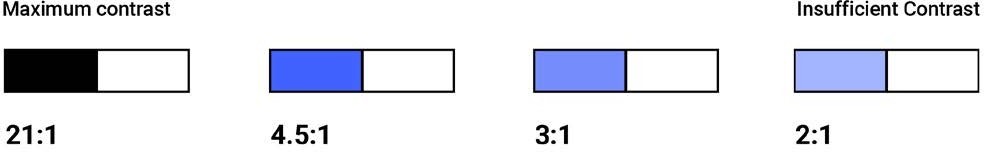
This image illustrates four examples of varying color contrast between two colors. When you reduce contrast, the contrast ratio reduces.
Avoid Using Images For Essential Information
Images are a great way to break up a document or supplement something in your content. They are not the primary way to share important information. If you want to include an image that conveys information, make sure to include a caption that describes the image for users who aren’t able to see the image. If your authoring tool allows for alt text, you can use that instead of a caption. Additionally, make sure that the informational elements of the image have a color contrast ratio of 3:1. Logos are exempt from this, as are purely decorative images.
Use List Formatting
If you are creating a bulleted list or numbered list in your document, then use the list formatting function in your authoring tool. Don’t manually number the list or use dashes instead of bullets. When formatting lists, assistive technology can understand the order of content so users can decide whether or not to skip that section.
Include Meaningful Links
If you link to a URL in your download, make sure link text clearly indicates the destination. Also, use the hyperlink function on your authoring tool, so users can simply click the link rather than copy and paste a URL. Links must be in a different color from the text and must have at least one other visual indication that they are clickable, such as being underline or bold.
Identify the Language
Modern assistive technology is multilingual, so you should identify the language of your document to enable the assistive technology to use the correct language profile. If you include a different language in your content, make sure to identify that too.
Use Tables Appropriately
Only use tables when you need to compare data. Do not use tables to control the layout of your document. Keep tables simple and consider using multiple tables instead of one complex table. This will help assistive technology users as well as users with cognitive and sensory processing disabilities.
Give Your File a Clear Name
Avoid using a string of letters and numbers for your file name. Instead, provide an easy-to-understand name, such as the title of the document and the year or version number. By providing a meaningful name to your file, all users will benefit from being able to easily find and understand what the file is about.
Creating Your Download for Document Accessibility
PDFs
If possible, export your PDF as a “tagged” PDF. This will make your PDF accessible because the export will include the format tagging mentioned in the checklist above. Not all authoring tools will allow you to export a tagged PDF. If that’s the case, export your PDF and then use a tool like Adobe Acrobat to add the tags.
Scans
If possible, try to avoid using a scanned document because there are significantly fewer accessibility options on scans than digitally-created content. However, if a scan is necessary, make sure the quality of your scan is as good as it can be. Avoid cut-off text, dark gutters on the edges, handwritten notes, poor contrast, etc.
Documents, Slides, Spreadsheets, and Other
Once you’ve applied this checklist to your document’s content, consider using a tool to check its accessibility. Microsoft and Adobe have these built in.
codemantra’s accessibilityInsight
To achieve accessibility compliance, accessibilityInsightTM validates documents, fixes, and remediates accessibility errors in PDF documents. AIN offers document remediation with machine learning suggestions along with human oversight.
Watch this quick explainer video to know about how document accessibility works!
Highlights
- Hassle free organization of documents.
- Quick and easy validation and remediation support.
- Supports Machine Learning.
- Comprehensive user experience.
For more information about our cloud-based platform that provides the most efficient solution for document accessibility compliance. Get in touch! engage@codemantra.com.